Mostly we are using slick-carousel to implement slides in web development. It is great library to implement different types of layouts, animations, speeds and etc.
To implement the carousel for items which have same width, we just need to specify the responsive settings for different screen size.
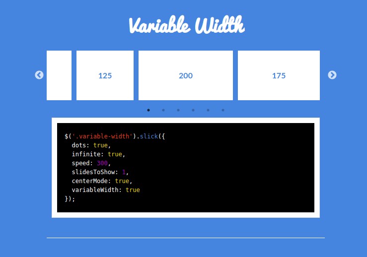
To implement the carousel for items which have different/dynamic width, there is an option variableWidth we can use. It works fine but there is a problem that the carousel navigation is not disabled until the last item is active even though there is no more item to show additionally. It is weird and that can makes confusing for the users to think like there are more items to show.
To fix that, it is better to build carousel from scratch. There is no active solution for this in slick-carousel yet. We can easily build the carousel using CSS transform/translate and ResizeObserver in JavaScript.


