Autosizer is a React component which is convenient to use when implementing mobile responsive.
We can wrap any component using Autosizer, and Autosizer propagates width and height of the component to it’s child components.
Child components can use this width and height to implement responsive.
Autosizer is especially useful when used together with Styled Components.
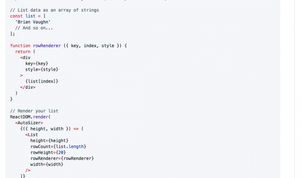
Many react-virtualized components require explicit dimensions but sometimes you just want a component to just grow to fill all of the available space. The AutoSizer component can be useful in this case.
One word of caution about using AutoSizer with flexbox containers. Flex containers don’t prevent their children from growing and AutoSizer greedily grows to fill as much space as possible. Combining the two can cause a loop. The simple way to fix this is to nest AutoSizer inside of a block element (like a <div>) rather than putting it as a direct child of the flex container. Read more about common AutoSizer questions here.