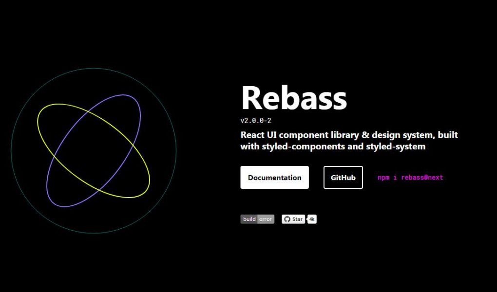
REACT PRIMITIVE UI COMPONENTS
BUILT WITH STYLED SYSTEM
Getting Started
Install the core Rebass library.
npm i rebass
ThemeProvider
By default, Rebass components are stylistically unopinionated and do not include a theme. You can add a theme to your application with a ThemeProvider component and by providing a theme in context. For this guide, use the Emotion ThemeProvider with the default Rebass preset theme.
npm i @rebass/preset emotion-theming
Wrap your application with the ThemeProvider component.
import React from 'react'
import { ThemeProvider } from 'emotion-theming'
import theme from '@rebass/preset'

export default props =>
  <ThemeProvider theme={theme}>
    {props.children}
  </ThemeProvider>
Alternatively, if you’d like to use Rebass with Theme UI, you can use the ThemeProvider from theme-ui, or use gatsby-plugin-theme-ui.
import { ThemeProvider } from 'theme-ui'
Composition
You can use Rebass components out-of-the-box to build larger, composite components.
import React from 'react'
import {
  Box,
  Card,
  Image,
  Heading,
  Text
} from 'rebass'

export default ({
  image,
  title,
  description
}) =>
  <Box width={256}>
    <Card
      sx={{
        p: 1,
        borderRadius: 2,
        boxShadow: '0 0 16px rgba(0, 0, 0, .25)',
      }}>
      <Image src={image} />
      <Box px={2}>
        <Heading as='h3'>
          {title}
        </Heading>
        <Text fontSize={0}>
          {description}
        </Text>
      </Box>
    </Card>
  </Box>
All components in Rebass are extensions of the base Box component, which includes an sx prop for theme-based styling as well as a standard set of Styled System style props.
Extending
You can also use Rebass components as basic building blocks and extend them to create custom UI components, which is a great way to get started with a new design system without boiling the ocean.
// custom button example
import React from 'react'
import { Button } from 'rebass'

export default props =>
  <Button
    {...props}
    sx={{
      fontSize: 1,
      textTransform: 'uppercase',
      borderRadius: 99999,
    }}
  />
Theming
Use the default Rebass theme or completely customize the look and feel with a custom theme. Since Rebass follows the Theme Specification, any theme built for use with Theme UI or Styled System will work out-of-the-box.
import React from 'react'
import { ThemeProvider } from 'emotion-theming'

const theme = {
  fontSizes: [
    12, 14, 16, 24, 32, 48, 64
  ],
  colors: {
    primary: '#07c',
    gray: '#f6f6ff',
  },
  buttons: {
    primary: {
      color: 'white',
      bg: 'primary',
    },
    outline: {
      color: 'primary',
      bg: 'transparent',
      boxShadow: 'inset 0 0 0 2px'
    },
  },
}

export default props =>
  <ThemeProvider theme={theme}>
    {props.children}
  </ThemeProvider>
Variants
Each component accepts a variant prop, giving you multiple styles for buttons, cards, text styles, and more. You can define custom variants in your own theme or use the defaults from the Rebass preset theme.BeepBoop
<Button variant='primary' mr={2}>Beep</Button>
<Button variant='secondary'>Boop</Button>