I’m not sure if it’s the best solution but I use this with another component (antd progress bar):
- Create a Gradient component (something like this):
class GradientSVG extends Component {
  render() {
    let { startColor, endColor, idCSS, rotation } = this.props;

    let gradientTransform = `rotate(${rotation})`;

    return (
      <svg style={{ height: 0 }}>
        <defs>
          <linearGradient id={idCSS} gradientTransform={gradientTransform}>
            <stop offset="0%" stopColor={startColor} />
            <stop offset="100%" stopColor={endColor} />
          </linearGradient>
        </defs>
      </svg>
    );
  }
}

export default GradientSVG;- Insert this component in your DOM.
- Reference your id in your CSS. In your case, probably something like this:
.CircularProgressbar .CircularProgressbar-path {
  stroke: url(#idCSS);
}
I’m using this Gradient component example with antd Progress component.
I didn’t add any code to the ant lib, I’m just using it like this:
{svgGradient}
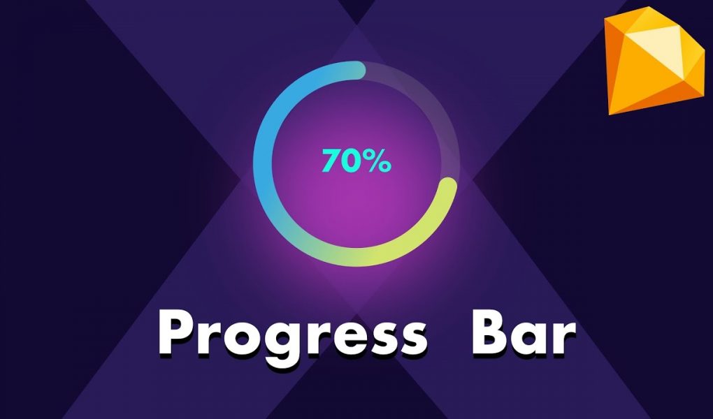
<Progress
type="circle"
percent={progressValue}
strokeWidth={8}
width={progressWidth}
className={className}
format={percent => `${percent} %`}
/>With svgGradient like this:
<GradientSVG
 startColor="red"
 endColor="blue"
 idCSS={gradientName}
 rotation={90}
/>
As long as the UI library you’re using is creating some SVG under the hood, you should be ok with that method.